Promotion & Marketing Project Related
AltPick 20 Years> ON SILK STOCKINGS, CIGARS AND TURNING 20

FROM “Some Kind of Blog” by Clare Ultimo
My favorite 20 year old is celebrating an amazing history of creativity and commitment this year. And while I do know a lot of 20-year-olds, I’m talking about The Alternative Pick, the place to find edgy photographers, illustrators, multimedia and design since 1992. AltPick.com went live in 1995.
It’s a bit of graphic design history in the making, you might say. AltPick has been attracting the freshest talent in the business from the start of it’s youthful life. Founder Maria Ragusa wanted this to be the cornerstone of their existence and it was. Back in the day, if an illustrator, photographer, or designer for example, wanted to let an art director or editor know they were around, outside of going door to door with a portfolio, there weren’t many options to choose from. The big and beautiful “Black Book”(where Maria cut her teeth in the business for 13 years) was a coveted and expensive venue for any new kid on the block but it was one of the more effective ways to “be seen” at the time. I remember finding it in the offices of Art Directors and Creative Directors, on their desk or hanging out on their bookshelf; it was a necessary tool of the trade. After all, this was a time when books and stuff on paper were our main source of staying connected!
The first edition of the Alternative Pick book was square, (8″ x 8″) full color, gorgeous and glossy. And my brand new design studio could actually afford a full page spread it in it! That was another thing Maria wanted to offer fledgling groups like mine – an affordable option to advertise our work. Warner Music saw my spread that year and kept my studio busy for quite a while! The book’s reputation quickly became one that looked ahead to where our profession was going and I think in the 20 years they’ve been around, AltPick never looked back!
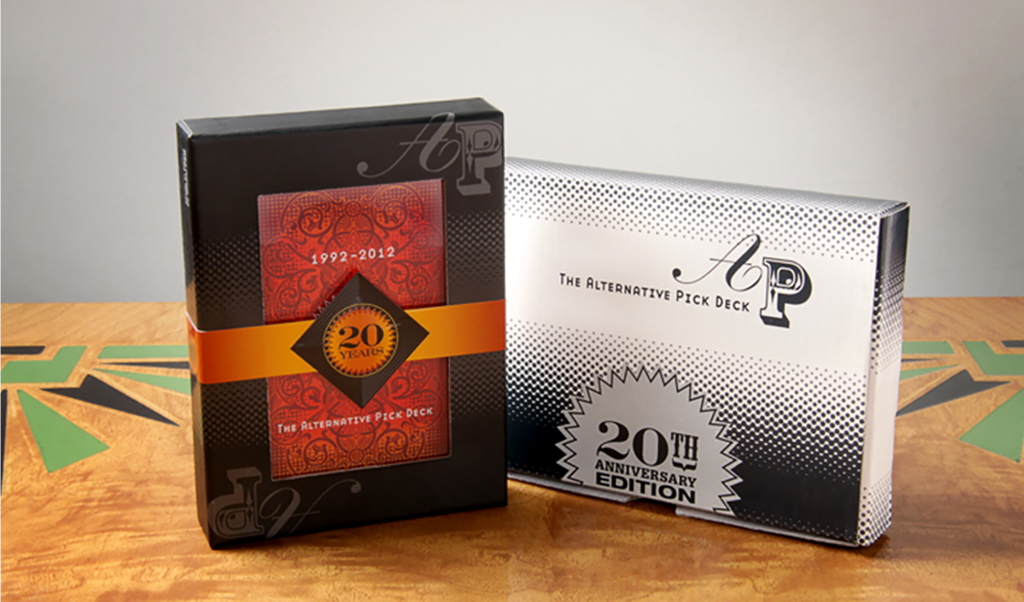
AltPick is a large interactive online community now, with friends and members around the world. The AltPick Card Deck is a unique way Maria likes to connect artists and art buyers beyond cyberspace every year. And I love cards. They are always playful. They don’t take up too much space on your desk and these of course, give us an enticing peek into our constantly changing creative world. So you can imagine I was pretty thrilled when Maria asked me to design the packaging this year.
“Think magic”, she said. A big concept that is purposely mysterious and generally unexplainable. Like sex, I thought! The 2012 package began to take shape in my head in a place where black silk stockings and an exotic cigar are having a drink. Dramatic color, historic references (the backs of old fashioned playing cards with gold gilt edges) and a whimsical “A P” – all aiming to look like they were having fun and belonged together. And of course, all of it in the service of providing a suitable home for the wonderful artwork inside the box! Please see the website below and get yourself a deck!
Maria is always looking for the connections that we have yet to find as artists (and as people too), encouraging the AltPick community to do the same, and I guess that was the biggest inspiration of all for me when I designed the deck. The attraction that the AltPick audience has had over these 20 years to what is not yet labeled or categorized is encouraging to me as a creative. Still figuring it out, still bringing the unexpected together, still surprising us after all this time…Happy Birthday baby!
–Clare Ultimo
Website: www.altpick.com
TESTING THE BOUNDS OF VISUAL COMMUNICATION
By Poppy Evans
Appeared in “Step by Step Graphics” magazine; Vol. 14, No. 3; May/June 1998

Clare Ultimo expected to push herself when she founded Ultimo, Inc. in 1987. That was the whole idea. “I thought (running my own design firm) would allow me the greatest range of experiences,” she says. “I also knew it could deliver the greatest range of challenges.”
Ultimo often finds herself pushing her clients, too, pressing them to move beyond traditional ideas about what design should be. “I’m interested in holistic ideas,” she says. “Sometimes clients think I overstep my bounds because they expect me to be a print designer, but I’m not limited to that in the way I approach a project.” For example, Ultimo is not above advising a client who asks for a brochure to do some telemarketing instead if she feels that’s the best way to meet the communications objective.
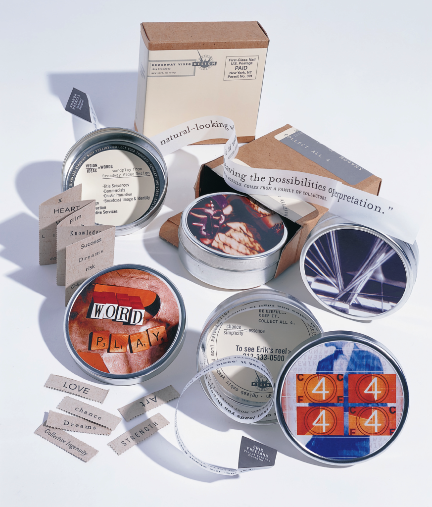
“It all comes down to understanding the medium and really listening to your client, as well as helping everyone involved understand the problem as her firm’s direct mail campaign for Broadway Video, unusual as it is, is characteristic of Ultimo’s penchant for communicating in unique ways. “I feel strongly that direct mail can be much more intelligent than it typically is. That’s why we don’t generally seek out that type of work – it’s too conservative,” she says. “In the case of Broadway Video, we were a perfect fit.”
THE BROADWAY INTERACTIVE GROUP CAPABILITIES KIT
From the book “Graphic Design Inspirations and Innovations 2”
by Diana Martin and Lynn Haller/ Reprinted with permission from the publisher.

Objective: New York City-based Broadway Interactive Group, a new subsidiary of Broadway Video (a video and television design, editing and production facility), produces CD-ROMs on a variety of topics. Ultimo Incorporated was asked to quote on designing and producing its capabilities kit and services information sheets. Ultimo quoted a fee based on a four-color, pocket-folder format, 9″x12″ in size.
Challenge: After receiving Ultimo’s estimate but before the project began, the client contacted Ultimo with an update: Needs were changing for this start-up company. The kit may or may not need to hold a demo VHS reel; it may or may not need to hold a CD disc. A potential client might get printed materials, a VHS and a CD, or only printed materials or just the VHS, depending on many factors. The combinations were endless, it seemed.
The client needed the new solution to stay within the parameters already quoted, since it had already been approved, (New companies have even more reason to hold to previously approved budgets than established companies for obvious financial reasons.)
Solution: Ultimo responded to her client about the budget first, saying, “Allow us to come up with a unique design and production solution, and we will work with the previous budget relative to our in-house fees (within reason). But you are responsible for paying all production and manufacturing expenses.” The client agreed. While working with the original quote would normally have been out of the question, the studio’s experience with Broadway Video had shown them to be excellent design partners, whose innovativeness supported design creativity.
When the design stage began, Ultimo and designer Cynthia Spence faced numerous limitations:
- No budget existed for buying photography, illustration or retouching.
- Only one thousand pieces were needed at the time.
- Each kit would be customized based upon a prospect’s needs and interests.
- The kit had to be able to contain some or all of the promotional materials without ever looking empty when pieces were missing.
- Production resources had to be used thoughtfully: The designers and the client agreed to use recycled paper and vegetable-based inks.
- The kit had to be mailable without damage.
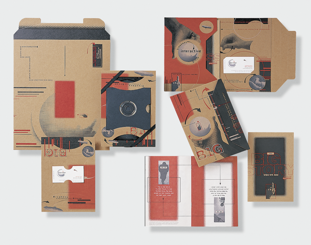
The designers overcame the project’s lack of imagery by letting size and paper create the needed visual impact. They sized the folder at 6″ x 9″, half the standard size, and produced it from industrial-weight 100 percent recycled, 100 percent consumer waste kraft board. Inside the folder, a booklet containing the capabilities/company information, various press sheets and letterhead would slip into horizontal pocket; a business card would attach to one of the panels. The folder could work as a self-mailer or in conjunction with the demo materials.
For those times when the kit needed to contain the printed and the demo materials, Ultimo and Spence designed a modular, single-die kraft board form. Two of these forms would slip over the demo’s front and back surfaces, before the demo was paired up with the 6″ x 9″ capabilities folder. Both pieces were then wrapped with a black elastic band and slipped into a 11″ x 13 1/2″ kraft board envelope. By using the same weight kraft board and printing red and black on the form, folder and envelope, the designers created unity and saved time and money.
Aphorisms and manipulated found art reflect the company’s services and personality and add a graphic impact.
Credits: Clare Ultimo Inc. studio; Clare Ultimo, art director/copywriter; Clare Ultimo, Cynthia Spence, designers; Broadway Interactive Group, client
